
Table of Contents
While Critic has been publicly available for a while, I have not really promoted it much outside of this site. I decided to launch on Product Hunt after researching competing products and their path to gaining traction. Similar products have done well there, and Product Hunt has a fantastic audience. There are not many sites that give you exposure to tens of thousands of people who are actively seeking new products. Product Hunt is the exception. Users are motivated to interact with new products. That is, they visit Product Hunt solely to find new things to try. It is the perfect audience for many types of products and services. Therefore, I really wanted to be featured on Product Hunt.
Preparing for Product Hunt
You find all sorts of strange advice when searching for how to get featured on Product Hunt. Thankfully, Product Hunt offers their own very simple guide for a great launch. After reading it, I decided other advice I found was either outdated or attempting to game the system. So I stuck with what Product Hunt recommended. It is very simple. Build your product, create some basic marketing collateral you will need later anyway, and “hunt” (post) your product yourself.
Payment Services
As I’ve covered in an earlier article, I delayed integrating payment services into Critic for as long as possible. However, accepting credit cards and managing subscriptions is a necessary part of low-touch SaaS sales. A common trend in being featured on Product Hunt is offering a promotion exclusive to Product Hunters. To do this well, I decided to finally bite the bullet and add payment services to Critic. I use Chargebee for managing subscription billing, coupon codes, and free trial periods. It is fantastic.
Marketing Collateral
There were a few marketing assets I knew would help me get noticed, but I dreaded making them. I decided to post an animated GIF as the product logo to attract eyeballs. Also, I felt a promotional video was necessary. Unfortunately for everyone involved, I am no designer. I also hate public speaking and recording myself. But my options were to create this content myself or pay someone for an engagement that may not have an immediate ROI. I chose to produce the graphics and narrate the video myself.
Video Production
If I had to do it over again, I would pay someone to produce the video. You can find plenty of shops that will produce decent promotional videos for a few thousand dollars. Considering that this video is reusable and standard fare for SaaS marketing, it’s well worth the money even if you don’t realize an immediate ROI. There are not many marketing assets I believe in outsourcing. However, given my novice audio/visual skills, I would not make a promotional video myself a second time.
In the end, I spent roughly two days writing a script, building a presentation, and recording myself. Over. And over. And over. You can judge the final result below for yourself.
I won’t say it’s bad. But it’s not great. It did the job well enough, especially compared to my first take. My first attempt at a script was 8 minutes long, far too long to keep casual viewers interested in the product. The final draft was around 3 minutes, and I ended up cutting out a few sentences to minimize fluff. I used Quicktime to record a presentation in Google Slides and a Critic demo in an iPhone Simulator. I then used iMovie to slice up the Quicktime recording and record myself reading the script. Much of the script was adapted from text I had already written elsewhere, including the Critic landing page.
Animated GIF Product Logo
Since I’ve skimped on design across everything I’ve done so far, I don’t have a product logo. This turned out okay since I wanted something animated anyway to draw attention to the Product Hunt listing. I was able to use clips from the promotional video to create a short GIF demonstrating the overall idea. Using emojis to convey what’s happening was helpful for this medium. You can’t see much detail in an 80x80 GIF (the size it would be on the Product Hunt page), but emojis are great at that resolution.
![]()
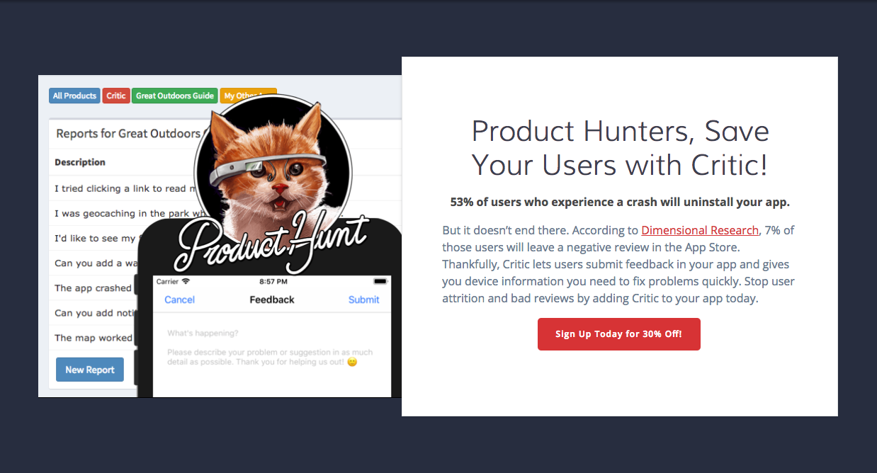
Critic's Product Hunt Landing Page
The only remaining thing was a landing page specifically for Product Hunters. Algolia created a dedicated landing page with a cute nod to Product Hunters when they were featured on Product Hunt. I decided to follow suit. I wanted Product Hunters to feel like I had made something just for them. Much of the copy came from my standard Critic landing page, but I added a little something special to the top graphic.
Being Featured on Product Hunt
Finally, it was time to post to Product Hunt. I followed the steps outlined in their official post for launching on Product Hunt to describe my product and show off my new marketing collateral. I posted Monday evening an hour or two before midnight because I wanted the posting to be pushed into the first batch of products on Tuesday morning. By including a promotional video, animated GIF for a product logo, and generally following the rules outlined in their post, I became featured. This was fantastic news because it meant maximizing my exposure on the Product Hunt home page.
I followed up on Twitter with a link to my Product Hunt listing and tagged @ProductHunt. From reading their launch guide, I knew I was more likely to get their attention by including a GIF of Critic in the tweet. It worked and Product Hunt retweeted me. In mere moments I had thousands of impressions and dozens of engagements on Twitter. I watched realtime analytics in Google Analytics and saw website traffic immediately pour in to my landing page. Everything was going according to plan.
The day Critic was featured, I was able to maintain a position on the home page for most of the day. While I eventually fell below the fold, I had exposure to Product Hunters casually scrolling through their feed for roughly 18 hours. I consistently saw a good amount of traffic from new users throughout the day.
Results and Lessons Learned
Unfortunately, I did not get the results I had expected from seeing similar products featured on Product Hunt. I will cover several reasons I believe my posting didn’t do as well as I would have liked, but there is one core reason I had a low conversion rate. I did not make conversion easy. It was this fact alone, I believe, that most greatly impeded me from having a more successful Product Hunt feature.
Internal Factors
Lack of Realtime Insight
While I was watching Google Analytics like a hawk, I was not equipped to immediately analyze and respond to visitor behavior I was seeing on launch day. I could see realtime behavior, but I was really wanting an overview of User Flows within my site so I could see where people were dropping off. I was not set up to have a way to examine this as traffic was coming in and instead had to wait until the next day to analyze trends. If I would have thought about it at the time, I could have dove into server logs, explored other reports in Google Analytics, or even reached out to people upvoting me to ask about their website experience. Instead I watched hundreds of visitors poke around and then disappear forever. I wanted to respond and adapt the site experience to increase conversions as the day went on, but I didn’t know what was happening.
An Unclear Happy Path
It turns out, the conversion funnel for Product Hunters was not great. While I did capture visitors’ attention, I didn’t succeed in turning most of those interested visitors into paying customers. Average time spent on my landing page was 2 minutes. That’s incredible! The page content kept users engaged longer than I had expected. I definitely had interested users. However, once I saw User Flows in Google Analytics, I saw a few problems.
Around 10% of visitors were clicking the Critic link in the site’s main navigation. This was likely very confusing for them. You see, since I recycled most of that page’s content when building the Product Hunt landing page, the link took users to a very similar page. I lost every single user that went down that path. Instead of keeping the same navigation menu, I should have directed users to the Critic signup page.
It was not clear to users how they could sign up. They probably wanted to give me all of their money. I just didn’t tell them how to do so effectively. In fact, it’s totally possible that the average time spent on the landing page was so high because users were confused about how to proceed.
Registration Process
Also, the signup page itself was a problem. Only 16% of users who reached the Critic signup page actually filled it out. It’s a dead-simple registration form, but I believe that was part of the problem.
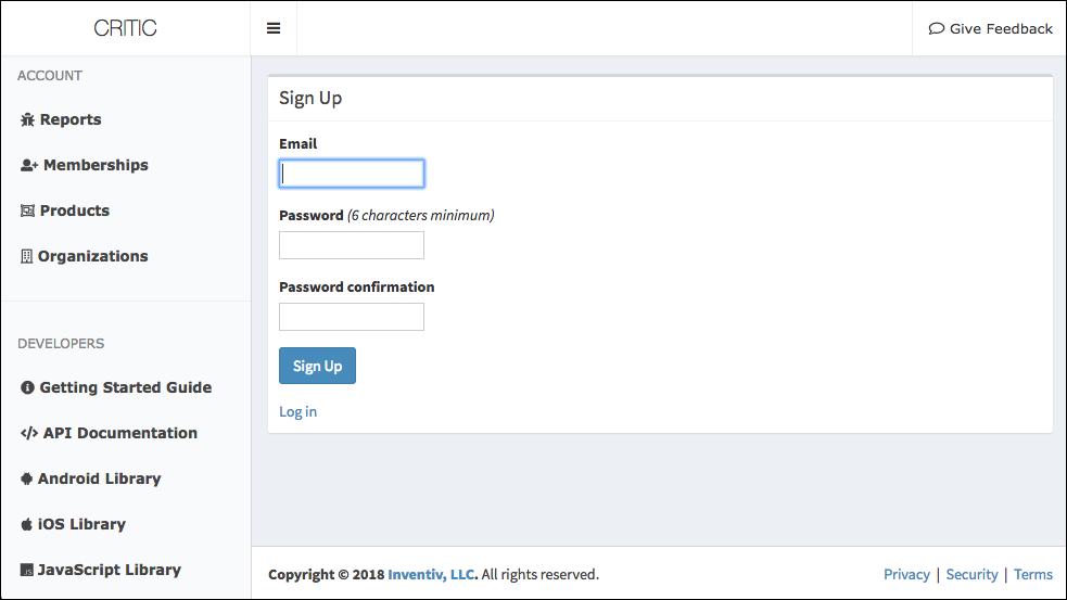
It looks so unremarkably plain compared to what users just came from. It doesn’t even look like the same company made this. Is this where I sign up for the Product Hunt promotion? What am I signing up for? How much is it? Am I getting the free trial or not?
Once you’re actually using Critic, I don’t believe you will care about the web portal design. If it provides immense value to your business, it doesn’t really matter how it looks in my opinion. However, as a new user, it’s a bit underwhelming and likely to turn people off. The signup form does not make it clear what users are signing up for. After the previous page speaks of a 30% discount, free trial, and multiple plans, this page leaves you with more questions than answers.
Ways to Improve
In the future, I plan to simplify the conversion funnel quite a bit. Pushing more information to the signup form will help people make sense of the registration process. Additionally, integrating the signup process into the landing page (or vice-versa) will save users a click. That signup integration will also eliminate any UI shock from users suddenly having a different design in front of them in the middle of the conversion funnel.
Finally, for special offers on special-purpose landing pages like my Product Hunt page, I should eliminate anything aside from the special offer. The only clear option should be to sign up for the promotion. The Enterprise Plan option can go away. Also, I can consolidate the Standard Plan and Free Trial options into one, since you automatically receive the 30-day free trial when you sign up for the Standard Plan. A link to other subscription options could still be present for interested users, but it shouldn’t be as prominent as the path I wanted most users to take. Instead of providing options, I should have focused everything on sending visitors down the happy path as quickly as possible.
External Factors
Again, I believe my major problem with conversions was due to my own mistakes. However, there were a couple of external factors that likely didn’t work to my advantage.
Competing Promotions
Prior to posting on Product Hunt, I saw that Instabug had ran a promotion on Monday. This meant interested Product Hunters who saw my feature on Tuesday likely would have just tried Instabug the day before. This was not the best news, but I decided to post anyway. I don’t know for a fact that this prevented people from being more interested in Critic. However, I am very glad I did not launch on the exact same day a competitor paid for promotion.
Other Excellent Products Featured on Product Hunt
I also posted on what appeared to be a marvelous day for Product Hunters. There were some fantastic products featured at the same time as Critic, and they simply won more eyeballs. You can tell right away from the production quality of their logos, media, and landing pages that these product companies cared deeply about their branding and user experience. I believe it paid off for them.
Ways to Improve
Neither of these external factors really change my business or my market. I simply failed to do as well as the competition. Good on them. They gave me some great examples that demonstrate how I can improve the next time around. Per my earlier design critiques on my own marketing collateral and signup process, I should consider paying someone with an eye for marketing and design to build a better user experience.
Also, while I believe Critic being featured on Product Hunt was a great opportunity, watching what got upvoted throughout the day gave me insight into the types of products that attract people most. Critic requires a software developer to be involved—even if it’s just for one line of code—whereas most featured products do not. Many of the products featured alongside Critic were targeting designers, marketers, and product managers. Additionally, B2C apps fared rather well. These products had wide appeal and minimal barrier to entry.
If I had it to do over, I would still post Critic on Product Hunt, but there is a better opportunity for products that are easier to adopt. Really trying Critic requires work, minimal though it may be. Most other featured products simply demonstrated their value immediately, no configuration or integration required. This has caused me to consider how I can further simplify onboarding for Critic. It only takes a minute to add Critic to your mobile app, but I’m sure I can do better.
Following Up After Being Featured on Product Hunt
I’m very happy to have had this experience. I was successfully featured on Product Hunt on my first attempt, retweeted by Product Hunt, received hundreds of site visitors, presented a problem and value proposition that was interesting to people, and found a lot of ways I can improve my product.
To ensure my new users are satisfied with the product, I will be contacting new Critic users individually during their trial period to see what they think. Additionally, I will offer assistance on integration and answer any questions they may have about what Critic can do.
I now have a lead list of people who have expressed some interest in Critic but have not yet converted. Product Hunters who upvoted Critic are at least somewhat interested in my product. I will reach out to them to see what prevented them from signing up. If nothing else, I will receive some feedback that may help me convert more users in the future.
Do You Want to Be Featured on Product Hunt?
Follow Product Hunt’s official launch guide to maximize your chance to be featured and seen by as many people as possible. Product Hunt is a great outlet for attracting an audience and getting noticed. If you would like another set of eyes on your product or marketing collateral prior to launch, I am happy to check it out. Contact me about your product if you would like some feedback.